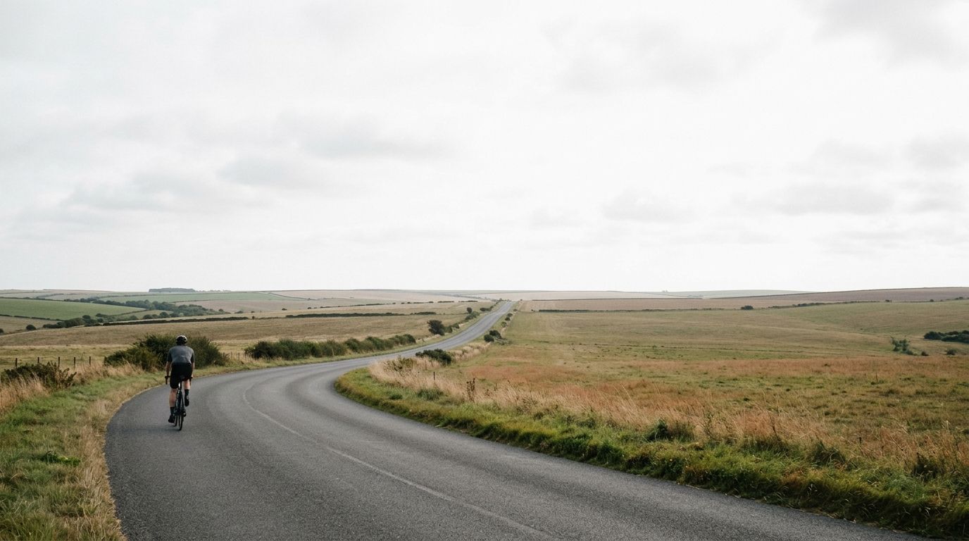
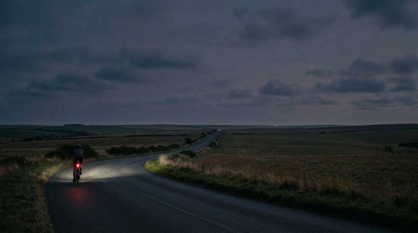
What the chart actually shows: from bottle to bloodstream
Every point on the chart corresponds to what you plan to eat or drink at that point on the route. A gel, a sip of water or mix from your bottle, a banana at a rest stop. The chart records it exactly where it's set to happen on the route, not as one total for the whole ride.
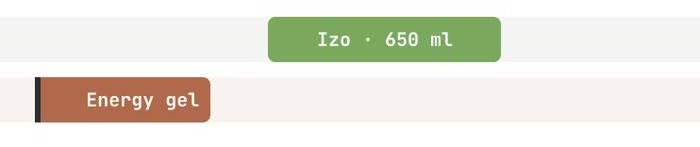
Food and drink don't turn into usable fuel the moment they reach your mouth. They land in your stomach and gut first, and digest gradually. There's a real lag between eating something and your body being able to use it. The chart shows this whole process — carbs sit in your gut for a while, waiting, instead of becoming available the instant you swallow them.
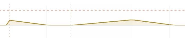
No matter how much you eat, your gut can only push a limited amount of carbohydrate into your bloodstream each hour. This is the absorption cap, and it shows up on the chart as a flat ceiling line. With a good glucose-fructose blend, that ceiling sits at roughly 90g per hour for most riders — see why this ceiling exists and how mixing sugars raises it. Eating more than the cap doesn't help — the extra just sits in your stomach longer.
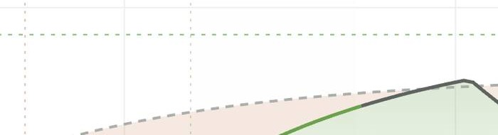
The "need" line is the demand side of the picture. It shows how many carbs your ride requires each hour, based on how hard you're working at that point — climb a steep hill and it rises, roll down the other side and it drops. Against it sits "absorbed": how much carbohydrate your body has actually taken in and can use, held back by two things at once — how much you've eaten, and the absorption cap. Even a well-fed rider can't push absorbed past the ceiling. Watching these two lines side by side, hour by hour, is the core skill of reading this chart.
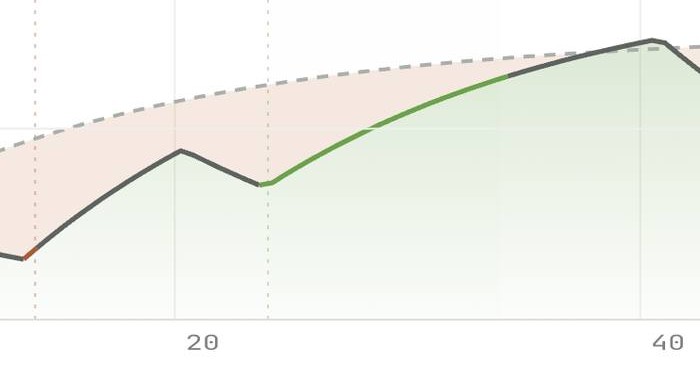
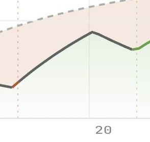
When absorbed drops below need for a stretch of the route, that gap gets marked as a deficit. This is where bonk risk quietly builds — not in one dramatic moment, but minute by minute, hour by hour. See what happens when that gap runs on too long, and how a small, ignored deficit turns into a real crisis on the bike.
Fluid works the same way, on its own pair of lines: fluid absorbed versus sweat loss, tracking hydration instead of carbs.
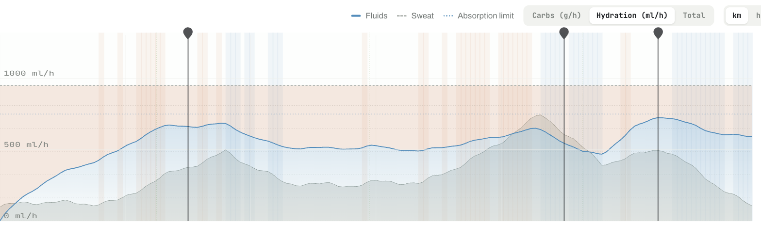
Seeing this whole pipeline laid out, instead of one number, is the actual point of the chart. It turns "did I eat enough today" from a question you answer after the ride into something you can watch coming, hours ahead, and fix before it becomes a problem.